
Recovery trajectories
An adjustable illustration of response size, settling speed and overlapping responses.
Updated 2026-09-14 · Archived
This is the text and publication record captured for this edition. Later corrections appear in subsequent editions. Website design and interactive software are not archived here.
Reading the curves
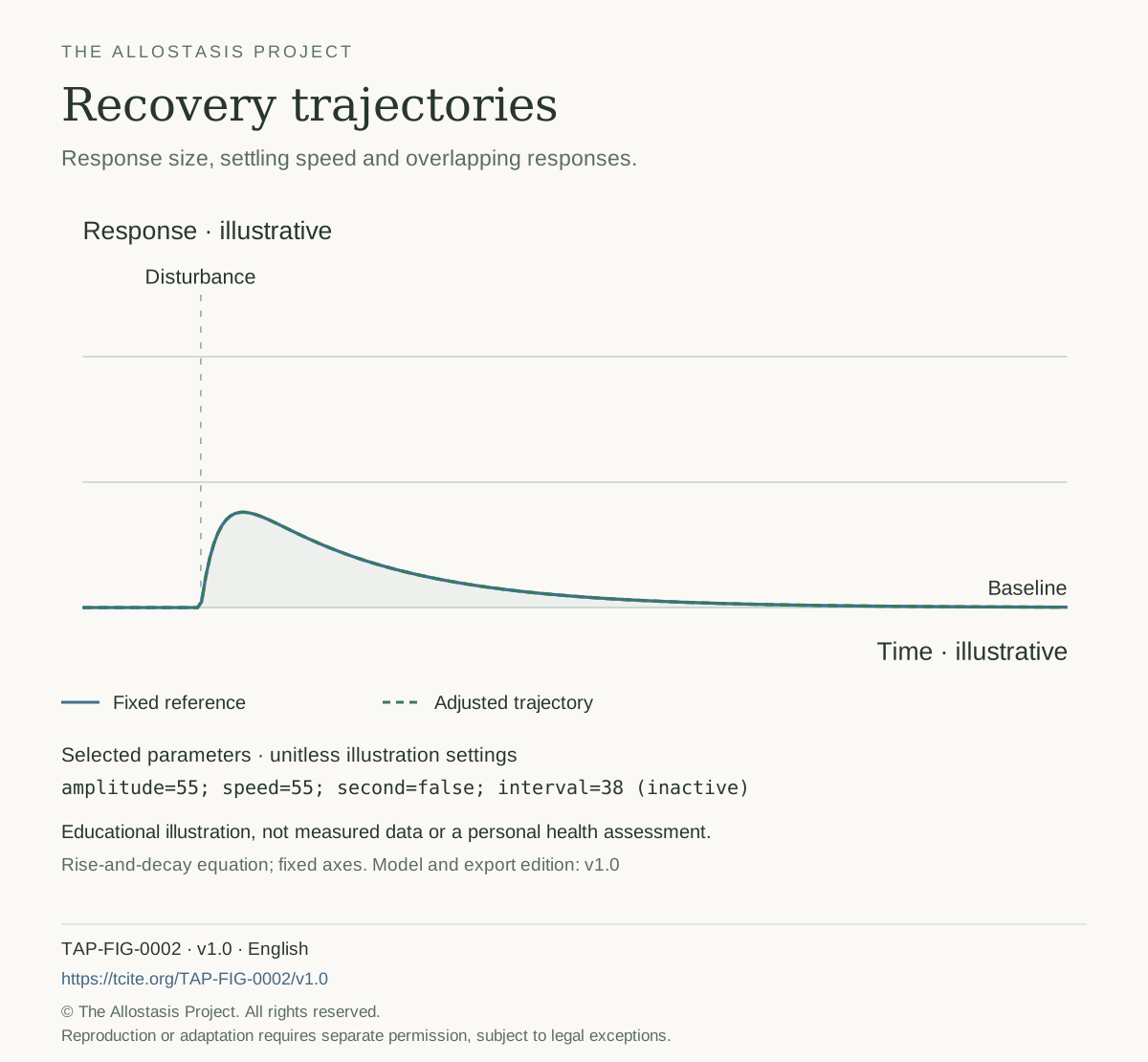
The blue line is a fixed reference. The dashed green line responds to changes in response size, settling speed and the timing of a second disturbance. Compare one setting at a time. Axes remain fixed so that scale changes do not hide differences.
These curves are generated from a simple rise-and-decay equation, not fitted to biological data. Adding a second mathematical response illustrates overlap; it is not a rule for adding real-life demands. The diagram does not estimate health, recovery time or physiological reserve. A smaller response or faster return is not necessarily better in every biological context.
A reproducible illustration
The archived SVG and PNG show the default scenario. A download from the interactive explorer records the selected parameters, model version and source. Parameter values are unitless illustration settings, not physiological measurements or recommendations.
Custom scenarios are generated locally in your browser and are not deposited as individual archived editions. To identify a custom image, retain its parameter line alongside the figure citation. The archive preserves the default illustration, equation and source text, not a historical copy of the entire interactive website.
Figure specification
tap-recovery/1.0; t=0..100; onset=12; r(s)=s<=0?0:(a/100)*(1-exp(-s/2))*exp(-s/(5+(100-v)*0.22)); second response at 12+i if enabled; fixed axes; default a=55,v=55,i=38,second=false
Publication record
TAP-FIG-0002 · v1.0 · English
The Allostasis Project is founded and supported by Resilio.
© The Allostasis Project. All rights reserved. Reproduction or adaptation requires separate permission, subject to applicable legal exceptions.